
Real-time dashboards differ from static charts in several ways. Data updates constantly, users interact with the visuals, and the interface must stay fast under load. Trading screens, IoT monitoring, infrastructure dashboards, telemetry tools, industrial software, and analytics products all depend on that stability. The challenge is not just drawing points; zooming, panning, tooltips, redraw speed, memory use, and browser behavior all matter. The library you choose affects the actual feel of the product, not just how charts look.
Not every popular chart library handles live data equally well. Some tools cope better with heavy data streams, while others suit lighter dashboards or business reporting. Update frequency, rendering model, time series support, interaction quality, framework compatibility, documentation, and licensing all shape the decision. This list includes different types of libraries, not five versions of the same tool. The goal is to show where each option makes sense in real-time dashboard projects.
Top Real-Time Charting Options We Selected
This list covers several approaches: a high-performance commercial library, a lightweight time-series tool, a popular open-source option, an enterprise UI suite, and a commercial data UI toolkit. The ranking is not based on popularity alone. Each library has a different role depending on data volume, update speed, interface complexity, and team needs. Below are the top 5 libraries selected for real-time dashboard projects.
1. SciChart
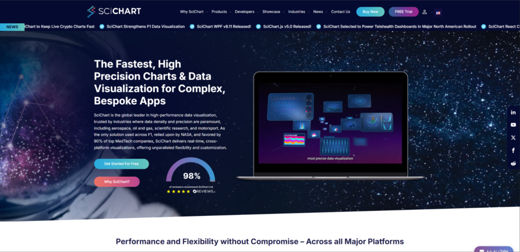
SciChart fits live dashboards where data updates frequently and users interact heavily with charts. The SciChart.js charting library is built for trading interfaces, scientific tools, medical software, telemetry dashboards, and monitoring platforms. It works best in products where chart lag can ruin the user experience. This is a commercial tool, so not every small dashboard needs it. Its strongest case is a product where real-time visualization is part of the main workflow.
Where It Fits Most Naturally
SciChart suits engineering teams, product teams, and software companies building data-heavy products. It is less relevant for simple static charts or small internal reports.
The value of SciChart in real-time scenarios goes beyond fast rendering. The library supports complex chart types, interaction, zooming, panning, annotations, and custom chart behavior. It gives teams more room to build demanding chart interfaces without treating performance as an afterthought:
- Handles frequent updates and large datasets in browser-based applications;
- Supports advanced chart types, including 2D, 3D, heatmaps, gauges, and polar charts;
- Keeps interaction smooth during zooming, panning, annotations, and live data changes;
- Gives developers control over styling, chart behavior, and custom workflows;
- Provides documentation, demos, examples, and support for production implementation.
SciChart looks best when charts are part of the core product experience. The paid license can be a drawback for simple projects, but it makes sense when chart speed affects retention, workflow, or decision-making. For lighter time-series work, uPlot offers a different tradeoff.
2. uPlot
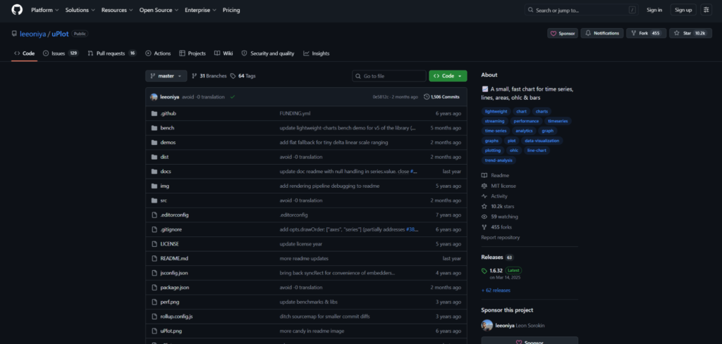
uPlot is a lightweight JavaScript chart library built for fast time-series graphics. Developers like it for minimal size, speedy rendering, and fewer abstraction layers. It suits monitoring dashboards, telemetry views, logs, metrics, and internal tools. uPlot is not a universal library for every chart type. It works better for technical teams willing to stay closer to low-level configuration.
Most Relevant For
uPlot suits developers building lightweight time-series dashboards, infrastructure monitoring pages, and technical metrics tools. It is less convenient for teams that need polished dashboards, many chart types, or enterprise support.
People choose uPlot for speed and control, not for visual polish. It fits cases where charts must be light, fast, and predictable. That makes it especially useful when the interface has to stay lean under frequent updates:
- Focuses on fast rendering for time-series charts;
- Keeps the library footprint small compared with heavier charting tools;
- Gives developers direct control over chart setup and behavior;
- Fits metrics dashboards, telemetry views, and monitoring interfaces;
- Avoids unnecessary UI weight when the project needs speed over visual extras.
uPlot can be a strong choice for technical dashboards, but not for every product team. If you need 3D charts, maps, polished defaults, or broad documentation for non-technical users, another library will make more sense. For a more popular open-source option, Chart.js covers different ground.
3. Chart.js
Chart.js is a popular open-source library for simple and medium dashboard tasks. It appears in projects that need clear line, bar, pie, or radar charts without complex setup. Chart.js can handle live updates, but it should not be treated as a heavy streaming engine. It works for teams that want to add basic real-time visualization quickly. For complex data-heavy cases, it needs testing under real load.
Better For Lighter Live Dashboards
Chart.js suits small SaaS dashboards, admin panels, simple analytics screens, and internal reporting tools. It should not be the first choice for trading platforms, telemetry-heavy systems, or dashboards with very frequent updates.
The main advantages of Chart.js are simplicity, popularity, and fast setup. It works best when live data does not create excessive rendering load. That makes it a practical option for teams that want basic charting without turning visualization into a major engineering task:
- Covers common chart types used in dashboards and reporting pages;
- Offers a simple setup path for teams adding charts quickly;
- Supports animated updates for lighter real-time use cases;
- Has a large community, many tutorials, and broad framework support;
- Fits products where charting is useful but not the main technical challenge.
Chart.js can be very convenient for simple live charts, but it should not be sold as a tool for the heaviest real-time scenarios. It is worth choosing when simplicity and community support matter more than maximum rendering depth.
4. Syncfusion Charts
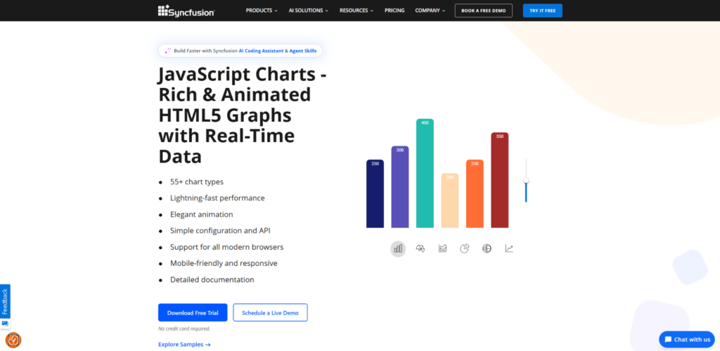
Syncfusion Charts is part of a larger enterprise UI ecosystem, not just a standalone chart library. It suits teams building business dashboards, admin systems, reporting platforms, and internal enterprise apps. Syncfusion becomes convenient when charts sit next to grids, forms, schedulers, and other UI components. It is not the best performance-first option for extreme data streams. The main advantage is the ready ecosystem and stable commercial support.
Good Scenario For This Tool
Syncfusion Charts makes sense for enterprise teams already using or considering Syncfusion UI components. It is less natural for teams looking for a tiny open-source library for just one chart.
Syncfusion Charts is useful when a real-time dashboard is part of a larger business application. In such products, chart speed matters, but so do consistency, support, framework coverage, and predictable UI development. It fits projects where charts need to blend into a broader application interface:
- Supports many chart types for business dashboards and reporting interfaces;
- Fits applications that combine charts with grids, forms, filters, and admin workflows;
- Offers commercial support and documentation for enterprise development teams;
- Works across major JavaScript frameworks and broader UI product stacks;
- Makes sense when charts are part of a larger business application.
Evaluate Syncfusion Charts as part of a wider UI set. For a standalone lightweight chart or a very specialized rendering engine, it may be too much. For another commercial enterprise option, Wijmo FlexChart offers a similar profile.
5. Wijmo FlexChart
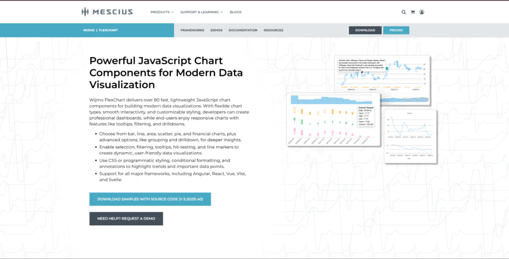
Wijmo FlexChart is a commercial charting tool within a broader JavaScript UI component set. It suits enterprise web apps, business dashboards, reporting tools, and data management interfaces. Wijmo becomes interesting where charts work alongside grids, inputs, and other structured UI elements. It is not an open-source option or the simplest choice for small teams. It looks better in products where the data UI needs to be stable and maintainable.
Practical Use Case
Wijmo FlexChart suits business software teams, enterprise app developers, and products with many structured data screens. It is less relevant for simple personal projects or sites that need one basic chart.
The value of Wijmo FlexChart lies in the combination of charting, framework support, and a wider UI ecosystem. In live dashboard scenarios, it makes sense when data updates are part of a business interface, not a high-frequency scientific or trading stream. It is more relevant for teams that want charting to sit inside a stable long-term UI stack:
- Provides charting tools for business dashboards and data-heavy web apps;
- Works alongside other Wijmo UI components for structured product interfaces;
- Supports common chart types, interactivity, and framework-based development;
- Fits teams that want a commercial toolkit rather than separate open-source pieces;
- Makes sense for enterprise products where maintainability matters.
Consider Wijmo FlexChart as part of a long-term UI stack. It can be excessive if the project needs only a few simple charts. For business-heavy products, it may be convenient, but for the heaviest real-time rendering tasks, SciChart or lighter time-series tools may suit better.
Final Thoughts
Real-time dashboards place different demands on chart libraries. SciChart fits heavy live data products, while uPlot suits lightweight time-series dashboards. Chart.js handles simpler live charts, and Syncfusion Charts or Wijmo FlexChart work better inside broader business UI ecosystems. The right option depends on data load, update frequency, and how central charts are to the product.
Before choosing, test the library with real datasets, update rates, and interaction scenarios. Look at zooming, filtering, panning, tooltips, memory use, and team support. If charts are a critical part of your product, testing matters more than popularity, demos, or polished examples on a marketing site.